The goal of pharmacy design is to ensure an outstanding customer experience. The creation of the Szirom franchise’s image fundamentally rethinks the conventional approach. Our aim was to create a space that possesses healing energies instead of the previously sterile and cold atmospheres, and radiates health through the evocation of nature.
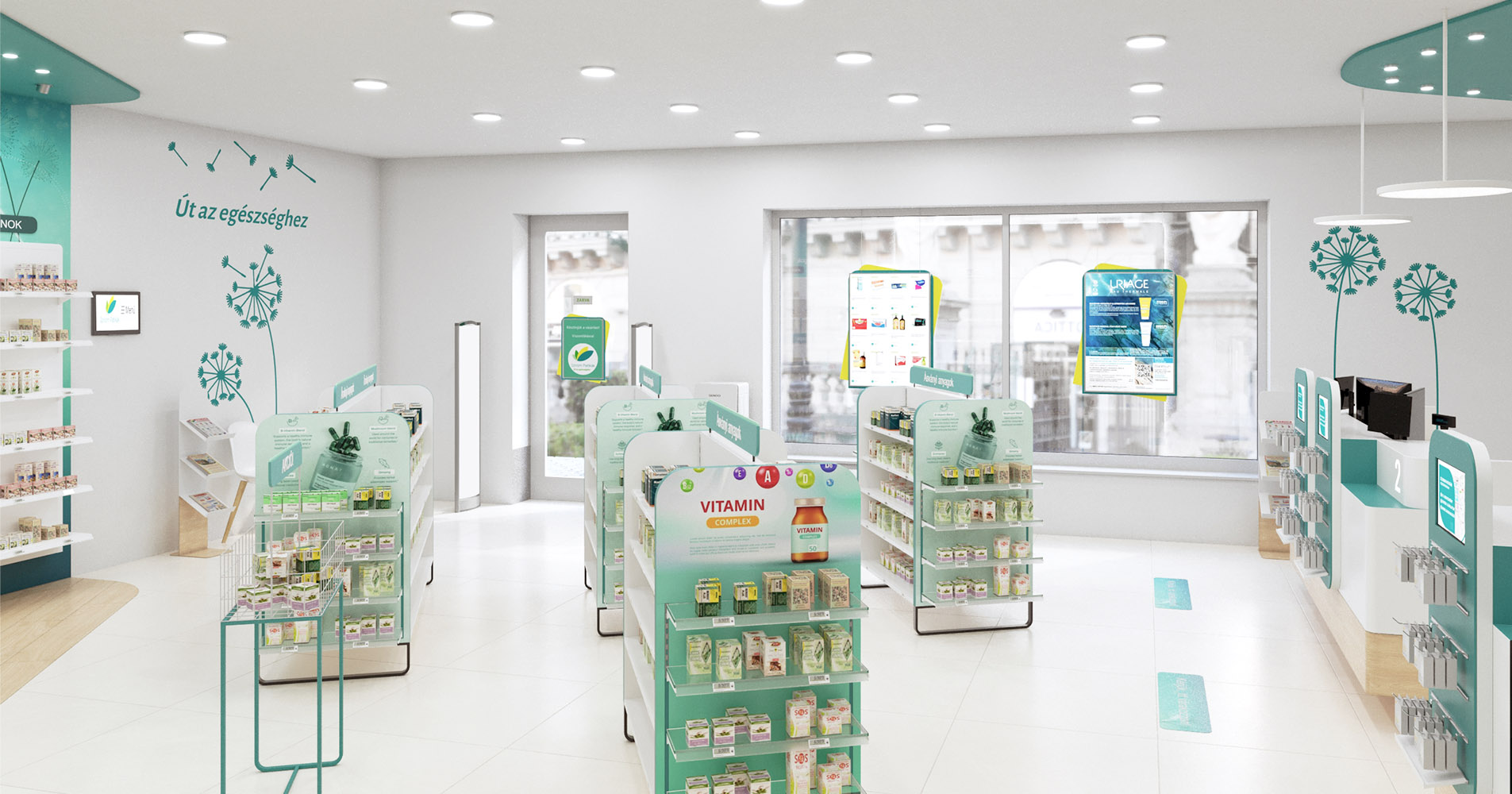
As we enter a Szirom Pharmacy, we encounter an atmosphere that combines the harmonious balance of innovation and functionality with a sense of calm. The color scheme is dominated by white and turquoise. White emphasizes the feeling of cleanliness and spaciousness, while turquoise radiates health and vitality, filling the space with life.
The concept of a pharmacy is no longer associated with illness, but with a place that promotes the preservation and nurturing of health.
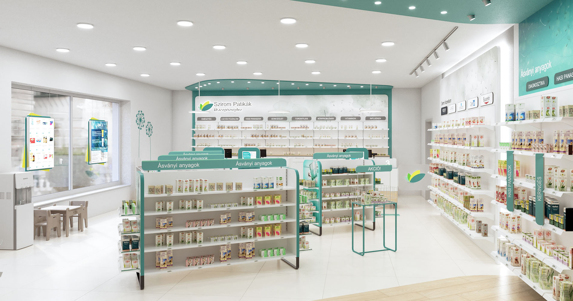
The choice of materials extends the design concept. In pharmacy design, natural light is indispensable, so to reflect our connection to nature, we opted for wood textures alongside glass without hesitation.
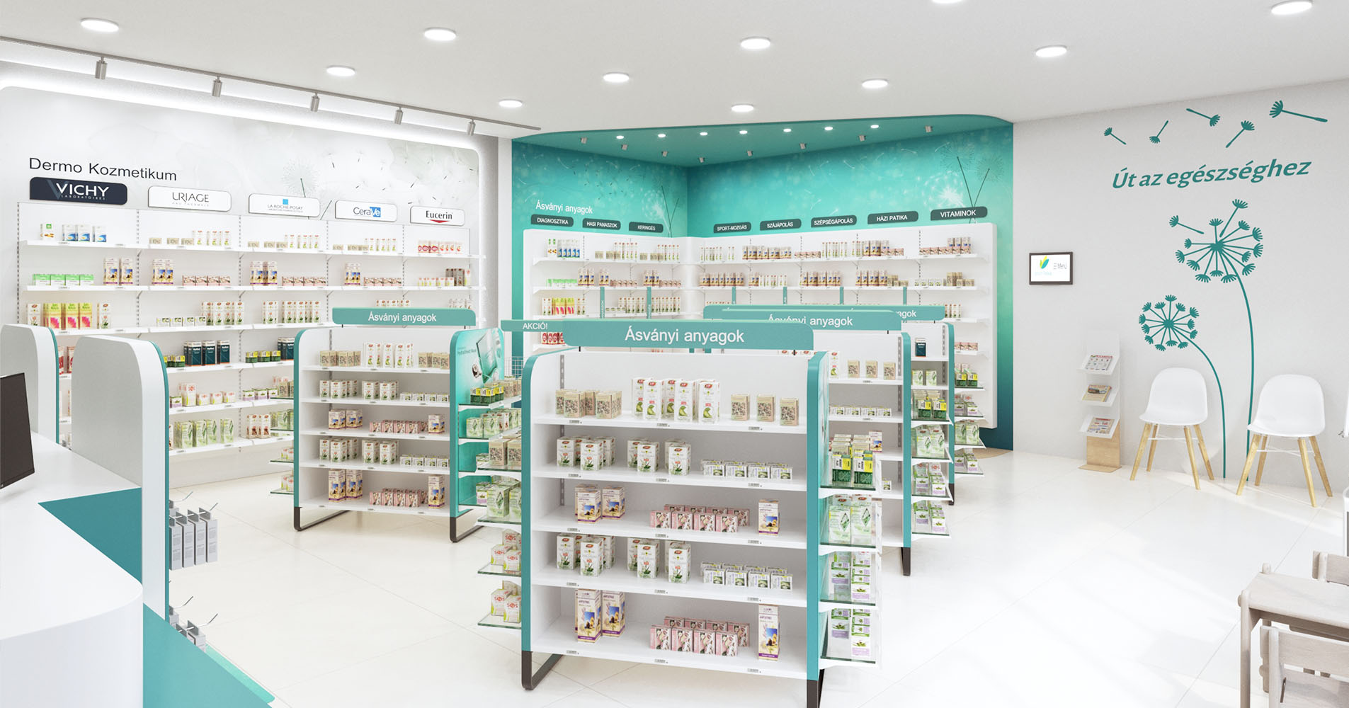
The exploration of the space is further aided by the pharmacy’s design, featuring a clean, transparent layout paired with clear product grouping. Thanks to the open, organized, and easily accessible shelving systems, navigating the products becomes an -
enjoyable experience for both pharmacists and customers.
This is supported by meticulously composed lighting, which aims to balance functionality and design harmoniously. In addition to general lighting, various types of lamps highlight different furniture and product types.
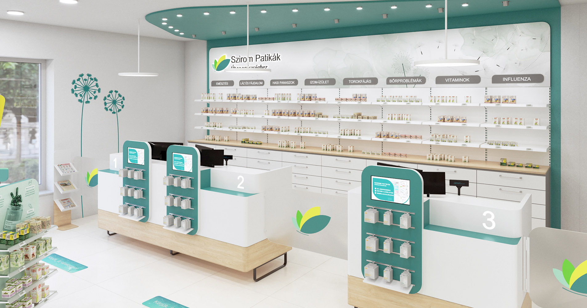
The gondolas ensure a directed flow of customers towards the visually appealing counters. Here, medication dispensing, other product purchases, consultations, and payments take place. The ceiling element highlights these areas, arching protectively over the customers like a petal, thereby reinforcing the -
connection and trust between the staff and the customers.
Thanks to the pharmacy design, the atmosphere of the pharmacies strikes a balance between professionalism and accessibility, combining usability, aesthetics, and customer comfort.
More pictures:
https://www.facebook.com/orangecubeorangecube/
More pictures:
https://www.facebook.com/orangecubeorangecube/